Case Study —
Deseret First Credit Union
Industry: banking, finance
My role: Lead Visual Designer, WordPress Development, Content Development
My deliverables: wireframes, brand style guide, high-fidelity design, live site

Client Goals
It didn’t take a designer to realize Deseret First Credit Union desperately needed a new website. As I started, I worked closely with my manager to establish three integral needs. Specifically, the site would need to:
- Be built responsively.
- Follow accessibility best practices.
- Include a modern look and feel.
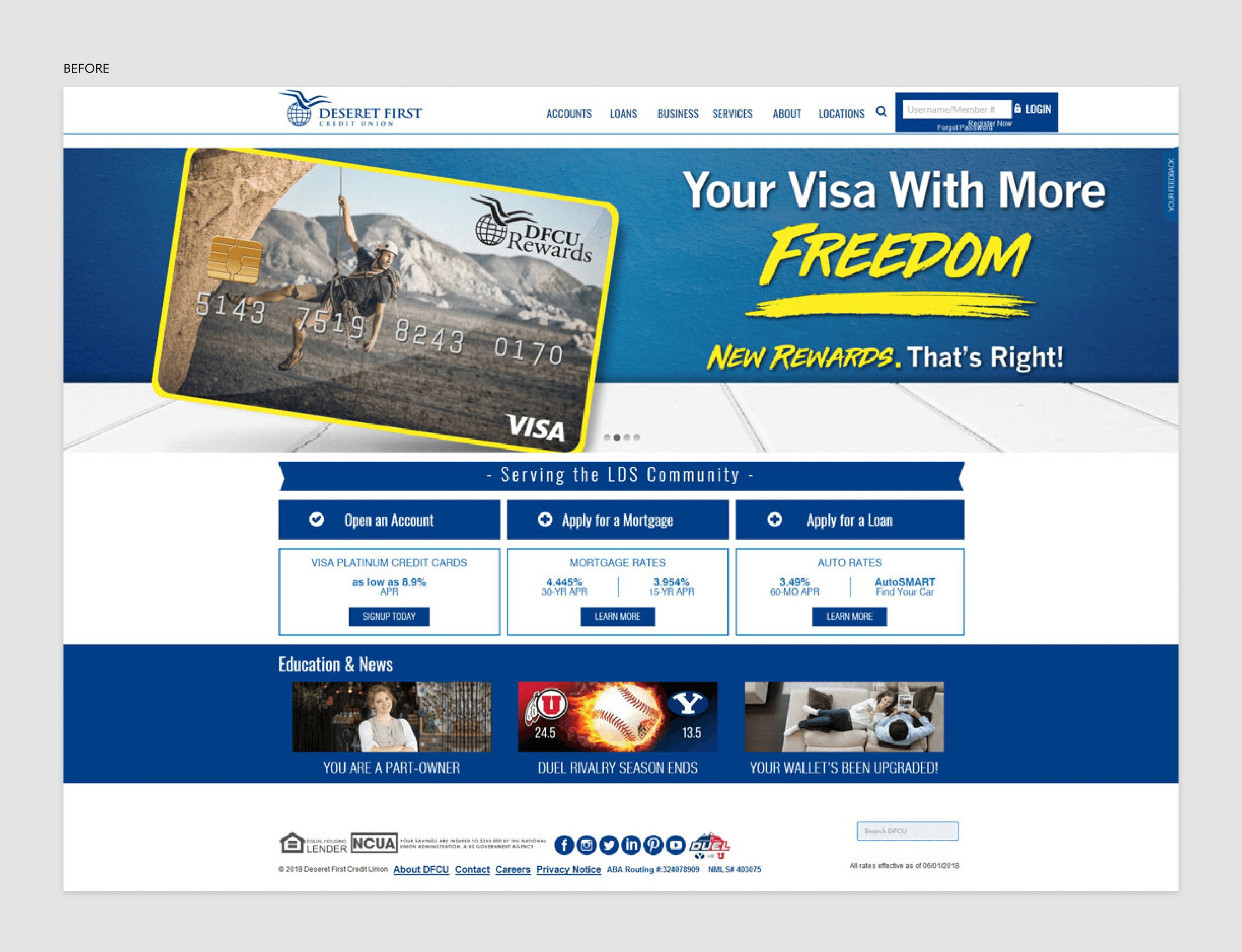
Process
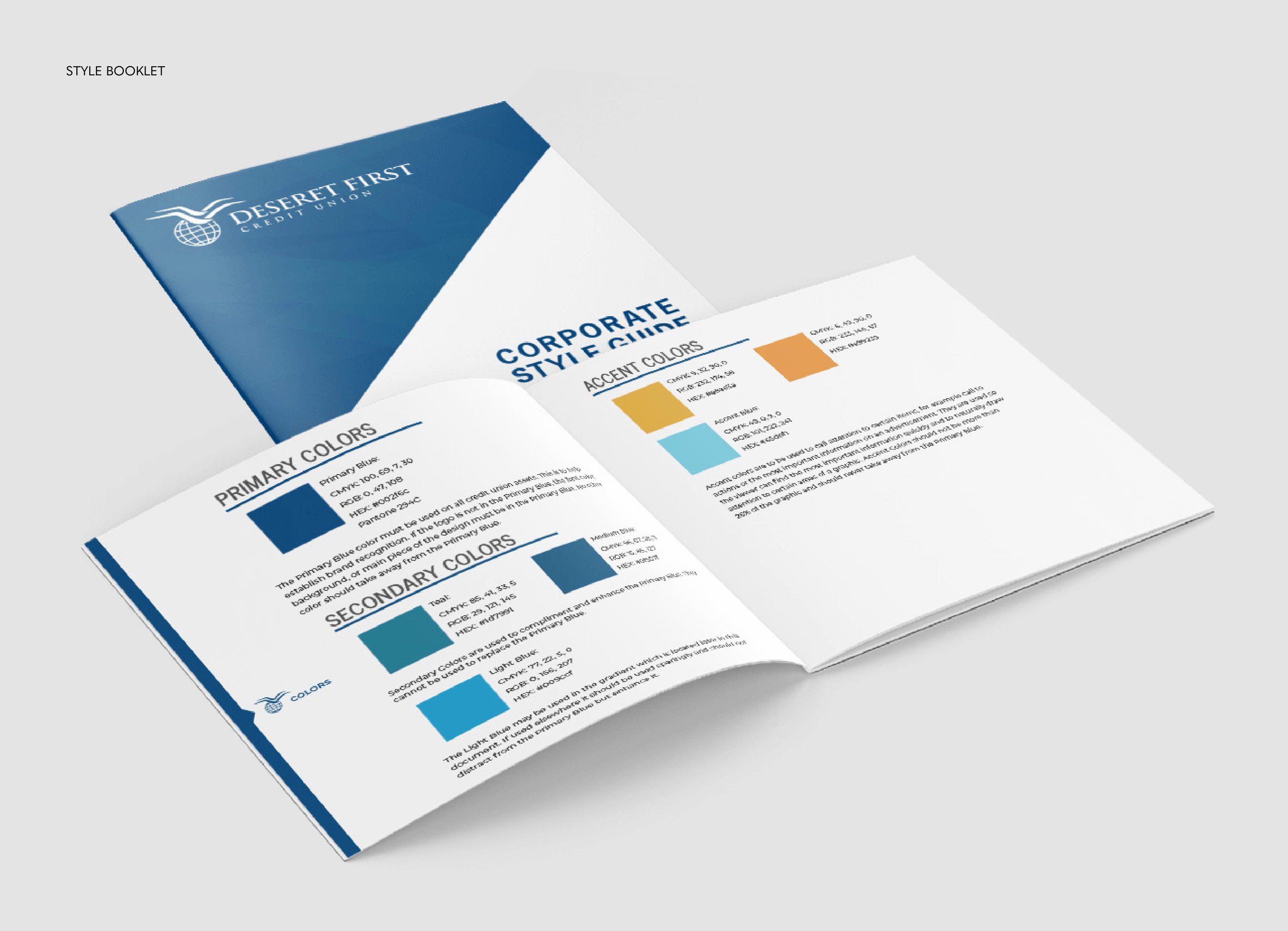
Deseret First gave me their current style guide, which merely included a single sheet of paper with the logo and a handful of fonts. That’s when I knew in order to achieve our established goals, we needed to backtrack a bit. The company needed a stronger foundation before starting the site redesign and I was prepared to initiate the process. I incorporated:
- brand personality
- target audience
- voice
- primary, secondary, and accent colors
- typography
- imagery
My manager and I worked with executive members to approve each of these items. Once completed, I had a much clearer direction of where I felt the company wanted to go.
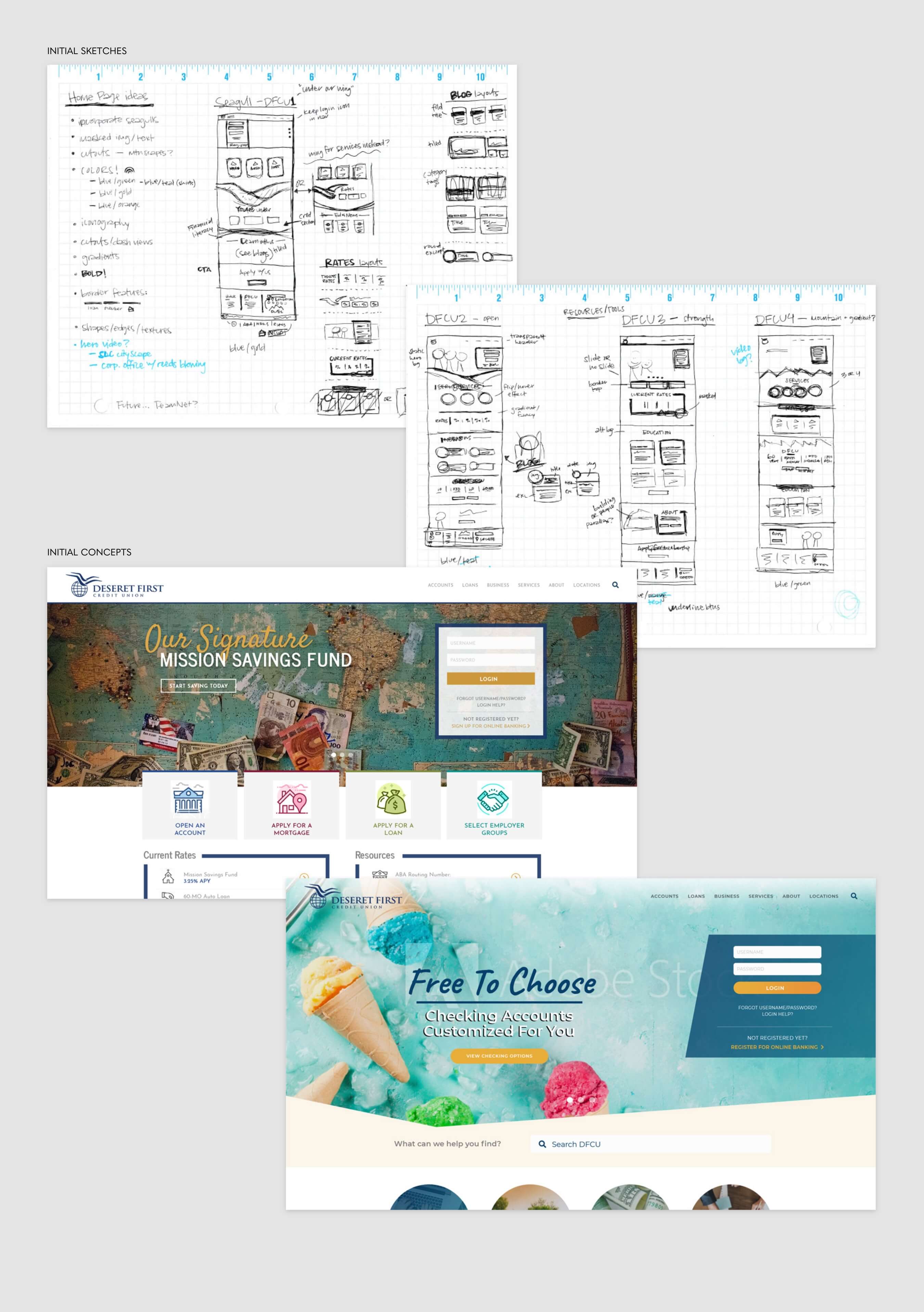
Early Sketches & Concepts
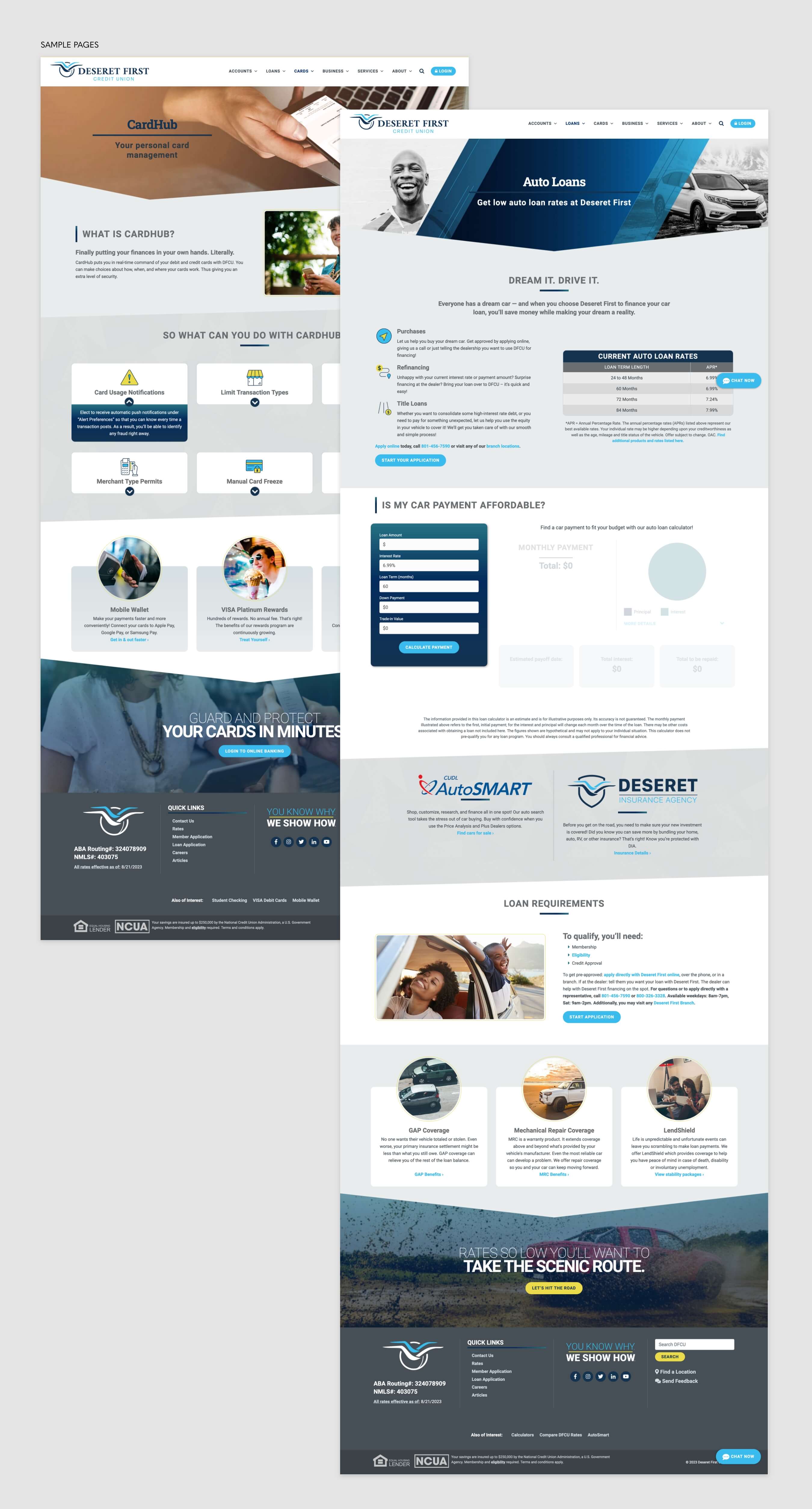
With stronger branding, I then created and presented 4 different home page designs to executive members. This committee and I all agreed that our approach wanted to feel more open, friendly, and bright than other financial institutions, while simultaneously being professional. The final selection was ultimately the best fit. We successfully built a new design style that built upon the familiar DFCU.
Challenges
One of the biggest difficulties from working with internal departments was getting them to speak in a more user-friendly voice. Lending and mortgage managers tend to speak in financial jargon, forgetting the average user doesn’t have the same background.
So oftentimes, I would take their language and have to rewrite it for readability. This was challenging for me, as I am definitely a stronger designer than writer. However, I knew updating the content was critical work for the both site’s usability and search engine optimization.
Successes
Our final site is a much more user-friendly and interactive experience than the previous version. We have earned exclusively positive feedback since our redesign announcement. The marketing team created a video to promote the new site to the credit union’s members, which gathered over 1000 views within the first weeks. And from our initial public launch, we only received 1 confused response out of 100s of visitors.