Case Study —
my529
Industry: investments, finance
My role: Lead Visual Designer
My deliverables: wireframes, design system, high-fidelity design
Background: my529, Utah’s state-sponsored college savings plan, contracted our team to revamp their public-facing website.

Initial Contract
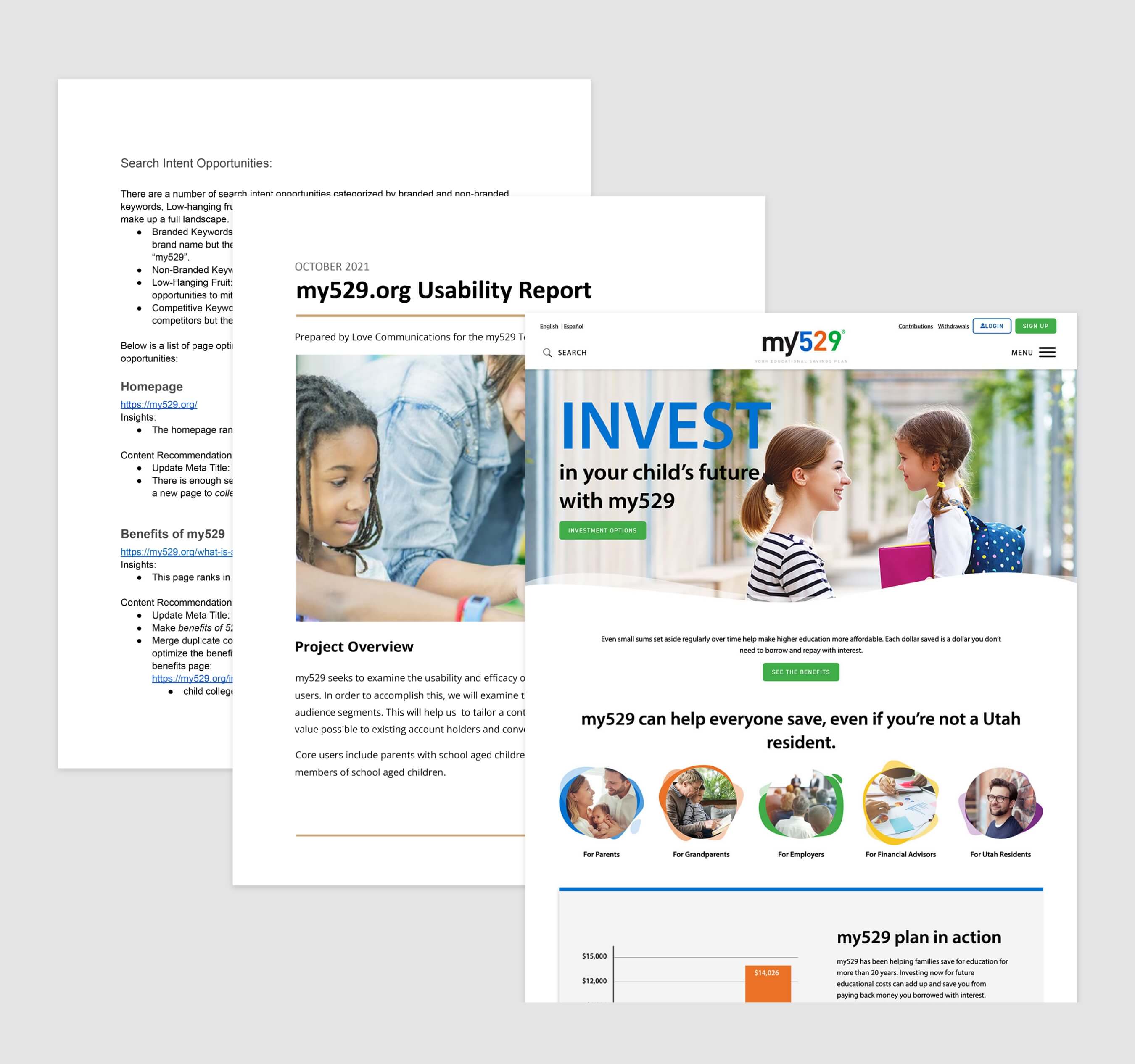
I worked closely with the UX Research & SEO teams to create a simplified site architecture and identify opportunities for improvement. My role encompassed:
- Distilling user feedback into research-based design decisions.
- Modernize the visual style of the website, including a component library for development.
- Creating 5 page templates for the client to utilize across the full site.

Ancillary Work
The my529 team loved the new visual style so much that it was then implemented across all mediums including print and billboard advertisements.
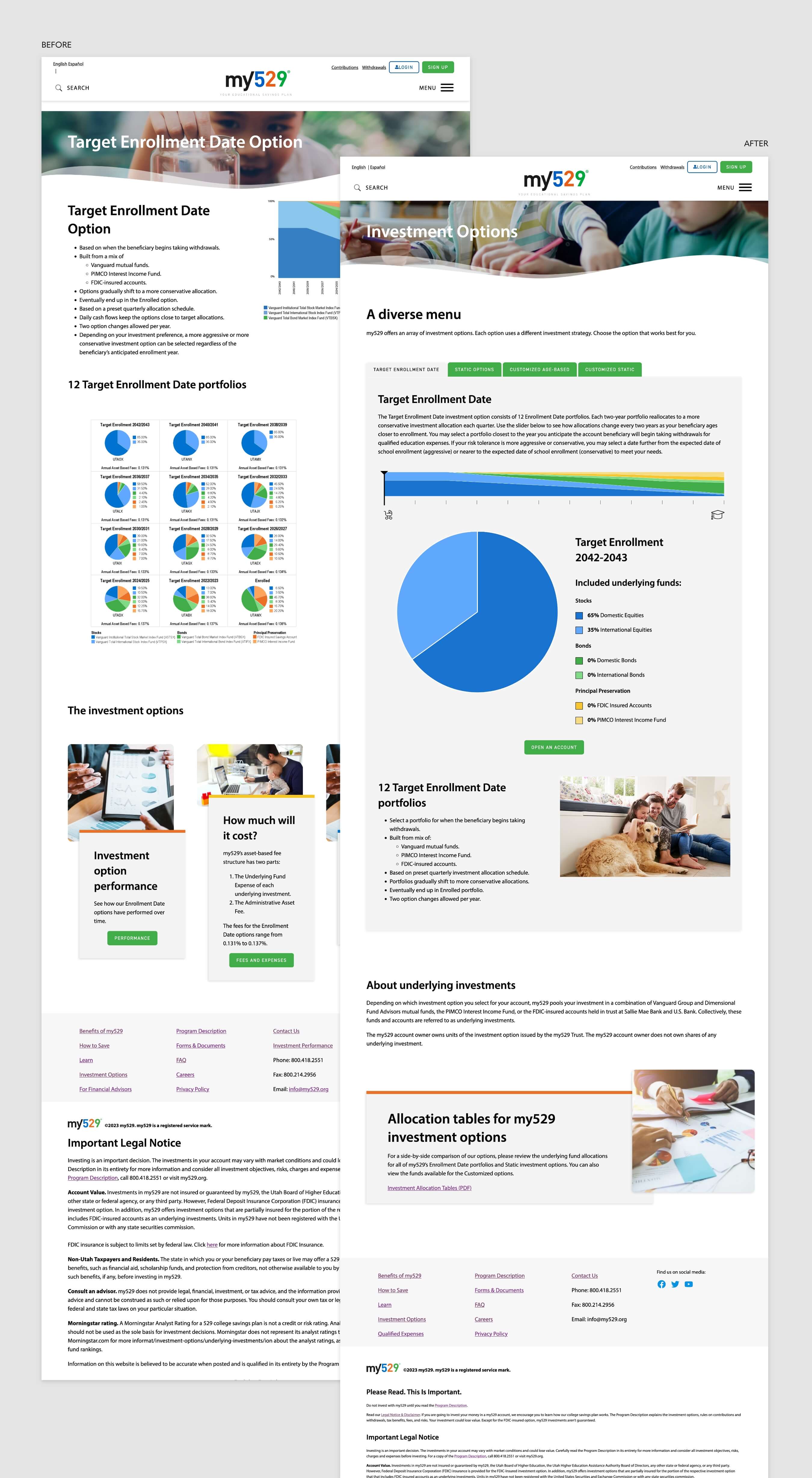
Further, the client returned to us requesting additional targeted work. Specifically, my529 wanted a new approach to present their Investment Options pages. The problem boiled down to:
How can we enable our investors to compare options, allowing individuals to select the best investment for them?
By facilitating a team-wide brainstorm with client, design, and development, we were able to sketch out a solution together. The new tool takes the static graphics and inaccessible PDF from the original page, turning them into a responsive, interactive slider. This allows a user to truly see how their investment allocations may change over time.
Development site is password protected.
Please contact me for viewing access.

